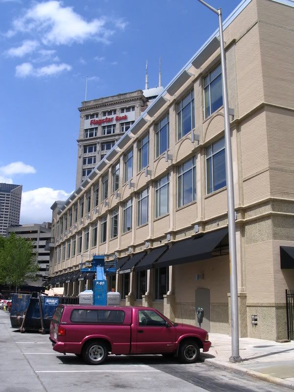
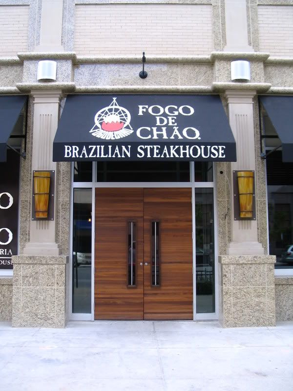
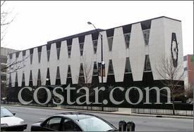
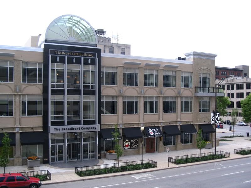
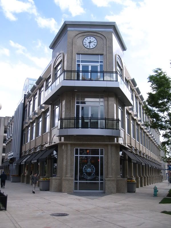
 I know architecture buffs are up-in-arms over the design of the Broadbent Building, but when I stand in front of the building, I rather like it. In fact, the street-level presence is really quite good. At the very least, I'm not aghast by this building, as I was when I stood in front of the previous design, commonly called the "Zipper Building." It may have been unique and I know some people admired it for that fact, but the street-level feel was incredibly uninviting. My memory is foggy, but I'm not even sure it had street-level windows. Here's a picture of the building borrowed from (you guessed it) costar.com:
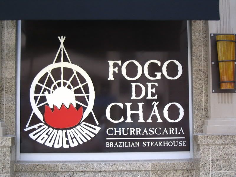
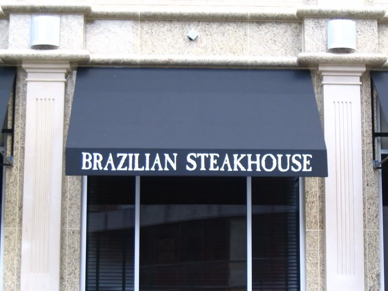
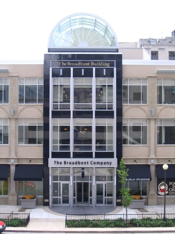
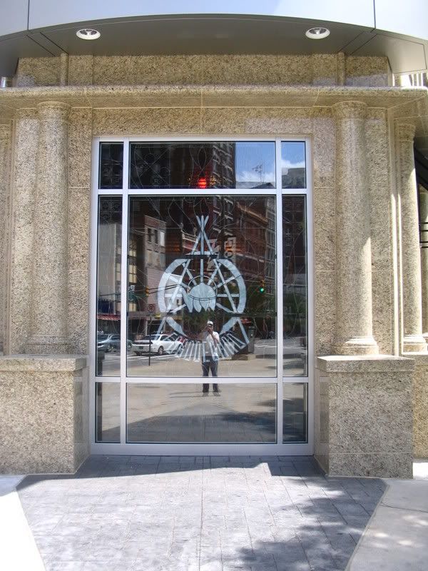
 Is the Broadbent Building a home run? No. But it's definitely a welcome improvement. In particular, I'm in love with the stained-glass window that Fogo de Chao has installed at the point of the first floor. I haven't seen it with full back-lighting yet, but I can only imagine it's going to look amazing at night. The black awnings are a positive addition as well.
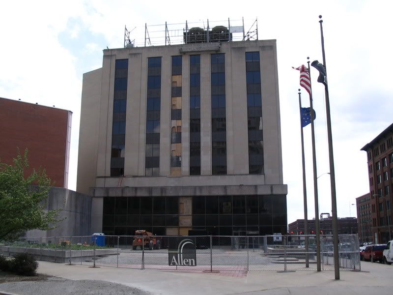
In closing, here's a shot of the on-going renovation of the Allen Plaza -- formerly Jefferson Plaza, directly across Virginia from the Broadbent Building -- rumored to be the future home of a Scotty's Brewhouse:



4 comments:
I definitely agree that the street presence of the building is a significant improvement over the zipper building. I drove by the other day and the new building frames the Washington St. corridor much better too. My big knock on the building is that it looks like they designed it by copying and pasting architectural elements out of clip art, and the facade elements are completely fake looking and very over done. I am really looking forward to the rest of the corridor to develop. It will really make the national road look great.
Well I am no architect, but I think the building looks pretty nice from those photos. I don't know if I ever saw the 'zipper' building, and I do kind of like the retro look of it. But this update is much better. I will be curious to try that steak house in the future, although I am just guessing it is going to be on the pricey side.
I think this is a great improvement over the old "zipper" facade. I haven't seen it in person since all the signage went up and I think overall this building looks really good. Could it be better? Definitely. But it's already better than what it was. There's a shopping center on the 16th St. Mall in Denver, I believe in the Tabor Center, that looks a lot like this at one of its entrances.
I think the small diagonal section of Virginia through there (and the surrounding streets) could make for a really great plaza. Ripping out those parking lots and converting the entire area to first floor restaurants / shops and 2nd floor up as office space would be really great. Even if it is jail adjacent.
You have no idea how excited I am for Fogo De Choa. I am a big fan of Brazillian Steakhouses. Green card means Go!
I actually was an intern at Bates USA in the "zipper" building. I am curious what the internal layout of the building is now since I worked there.
It was good to have you out last night, thanks for making it and bring some tasty beer.
Post a Comment