

Project AnnouncementWhat about all the dirty work in-between? That’s where DIG-B comes in. I attempt to follow as many projects as possible -- focusing primarily on the downtown Indianapolis area -- providing photographic updates of the construction progress.
Groundbreaking
Grand Opening
4 comments:
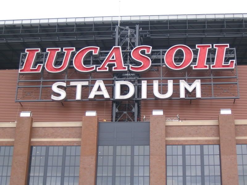
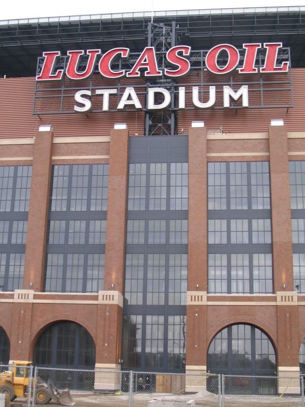
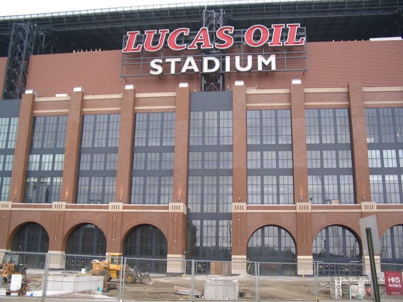
Even though I don't particularly care for the name (I didn't know who Lucas Oil was until they bought naming rights), I think the sign looks appropriate on the building. It is very readable from 70.
Rodney beat me to it...I was going to ask if it can be read from I-70.
I am just SOOOOO glad that the Lucas Oil logo did not get put on the outside of that building. It is horrible looking. There also seemed to be a positive typographic evolution in the design of the stadium. I've seen a few different type treatments on different renderings.
While the name's not great, for a sponsored venue, we could've done a lot worse.
I agree with the sentiments expressed here. But the ESPN radio nerd Colin Cowherd peeved me off a little when he said it was the "worst name for a stadium in professional sports". I think if Lucas Oil lived up to their suggestion that they may move their headquarters and new production to Indy, that would help with the local recognition. I think a small 15-20 story building downtown(in Lucasville?) would be appropriate, with production maybe done somewhere on Kentucky Ave. Just a thought(I also wish they would change that logo somehow, but its their business, literally).
Oh, and also have to give a shout out to CorrND for the awesome shots he got for me on Senate Avenue. My Area of Opportunity post should be about finished. Thanks for the help. Hopefully, me talking to developers this week will raise the visibility of development blogging amongst the suits.
Post a Comment