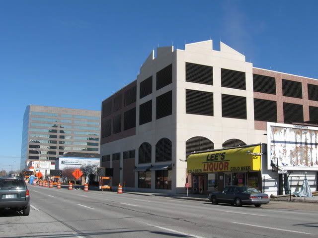


Project AnnouncementWhat about all the dirty work in-between? That’s where DIG-B comes in. I attempt to follow as many projects as possible -- focusing primarily on the downtown Indianapolis area -- providing photographic updates of the construction progress.
Groundbreaking
Grand Opening
18 comments:
I think it looks pretty darned good, myself.
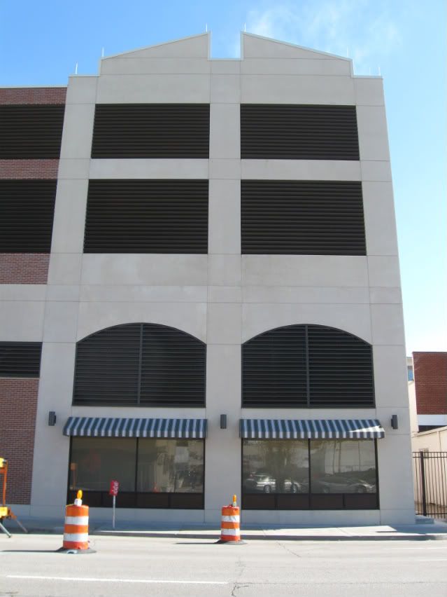
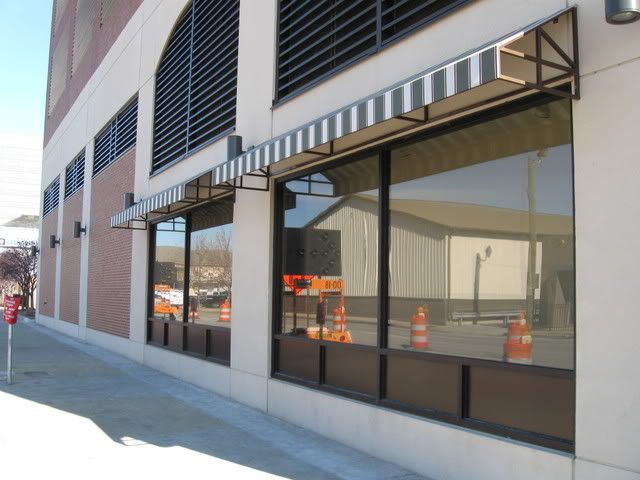
I particularly like that they added a "faux store front"... at least thats what I am assuming it is.
Thanks for the shout out, but Thundermutt just knows some people who know.
The shadowbox (i.e. depth to the blank white wall) is nice. It might allow for art installation.
I think this kind of infrastructure is kind of like parking garages...necessary evil. But if Citizens ultimately expands northward to fill up the block, it would be nice to put the downtown district police station in the ground floor...a 24-hour active use.
Ugh. I have a photo on my flickr page of how it looked before the unfortunate decorative wrapping.
http://www.flickr.com/photos/41754236@N00/3277406245/
I know most people disagree with me, but I think expressing infrastructure is generally far more beautiful than pretending it's not there. And a faux storefront is just insulting. Ugh.
Donna, I don't think we can make everything an 'amazing' and 'cutting edge' warped structure.
Most people don't care to see such buildings and this is a step in the right direction.
I've got to agree with anon. A couple of the world's biggest A/C compressor units are hidden behind that facade. I like the facade better.
For an alternative view, drive up Meridian and look at the big unit now in place on top of the Grain Dealers tower.
If honesty is "cutting edge" then we're in trouble.
Donna here, I've lost my blogger sign in somehow. Will figure it out tomorrow.
Speaking of warped: this compulsive desire to deny and "pretty up" the infrastructure that makes our contemporary society livable is what is warped.
Now if it mitigates sound pollution, that's important. but why PRETEND it's something that it's not? Why not make a wrapping that looks like what it does? Like using Field Office's Superabsorber panels. Why this fear of technology?
I just don't understand that impetus.
Why put a hood and fenders on cars and trucks? Why put the furnace in the basement? Why put stainless steel panels on a refrigerator instead of glass doors? Why hide wiring and plumbing and ductwork in walls?
It's not fear of technology, Donna.
Twenty years ago people would have said stainless steel panels on a refrigerator were "too industrial". Now they're considered sexy. And, of course, Subzero has some new super-sexy refrigs with glass doors!
Here's an architectural comparison: I think the dark space under the Arts Garden is great. It feels "big city" in a way that most of downtown doesn't. It feels like infrastructure, like we needed to stack things one on top of another to have enough space in the city. And then, it gives you relief to come out from under it back into sunlight. A little ugly makes the pretty looks moreso, yes?
Whenever I take visitors under it, they lament the oppressiveness. Yet then they love the bright open exceptionally non-traditional interior space - it's in the middle of an intersection! - of the Arts Garden itself. Bad with the good.
Again, I never know if links here work but look at:
http://archrecord.construction.com/features/BwarAwards/archives/01chiller.asp
Leers Weinzapfel's UPenn chiller plant. Celebrate that infrastructure! It's beautiful, or can be, with a tiny shift in the status quo.
But like I said, I don't expect most people to agree with me.
From the citation:
"The university recognized that a new chiller facility could more reliably and economically serve its growing medical and research complex, but also saw that the best site for it was too prominent for such a large, utilitarian structure to be built undisguised."
Penn is a private institution which has spent hundreds of millions of dollars making over West Philadelphia in the past 30 years. The campus has landmarks by Frank Furness, Louis Kahn, Eero Saarinen, and other great architects. (It also has five commie-block towers as dorms.) In fact, Kahn's lab building is a (long) stone's throw from the referenced site, and the location of the plant has indeed become the southern gateway to Penn because of the school's massive expansion over the years.
Contrast that with North Illinois Street, a high-speed one-way getaway arterial out of downtown lined with surface parking.
A "good" solid building in that spot is probably the best thing right now. It replaced an ugly pole-barn looking thing that had lots of surface parking and minimal screening.
I'll certainly agree that just about anything is better than a surface parking lot in a city. Really, IMO, even an ugly parking garage is better than a surface lot.
I'm just disappointed, you know, because when it started going up I thought it looked awesome: big, brawny, and bold. Now it's inoffensive, I suppose (except to radicals like myself) but it's also unremarkable. I'd rather see remarkably bad than unremarkable! ;-)
(Socrates here)
Donna, I don't think people have that sort of love for these things like you. I agree most things can be beautiful in their own way, but it doesn't mean we should expose them or make major moves on it.
I personally think under the arts garden is extremely dull and would be cooler if they had a glass floor or something.
To each his/her own I suppose.
Anyhow, the city followed general opinion and covered this up.
At least it isn't a barn.
BTW,
anything weird or odd is bold these days.
Kind of sad really.
Thanks for the comments, info and links everybody -- sometimes you never know what will spark a spirited discussion!
Donna knew she'd stir me up by bringing Penn into the discussion.
:)
Right on, thundermutt - Penn has done SO MUCH RIGHT in their approach to the urban design issues around the campus. of course, the flip side is they've essentially annexed all of West Philly as "campus" in the process, but dang it makes for a nice place to be.
Donna, West Walnut in Philly used to look a lot like North Illinois in Indy: a sea of surface parking, with the occasional remnant scary building.
I barely recognized the place when I took my son back for a visit several years ago.
Donna is right.
They've actually drawn more attention to the building by slapping on this uncreative, quick fix. Instead of spending a bit of time on an unique solution, they've created this Frankenstein of a building that actually exacerbates the concealment problem they were trying to solve. FAIL.
Why is an obviously false storefront more beautiful than a real utility? Are people's minds actually tricked into thinking it's a storefront?
Why is the default option always using some faux storefront? Are people stuck in Pleasantville?
Where is the creative problem solving? What happened to our ability to think originally and approach each design problem independently?
Seriously, what does a fake storefront have to do with concealing this utility? No one is fooled. It's still obviously some sort of giant machine.
Why are they trying to make it into something it's sooo obviously not?
And why, why do people in this city continue to defend sub-par, lackluster, bottom-of-the-barrel, lazy design?
Post a Comment