- Location: Northwest corner of Ohio St. and Park Ave.
- Height: 5 stories, plus an underground residents parking level
- Ground Floor: 1/3 retail fronting Ohio St., 1/3 retail parking, 1/3 residents parking
- Residential Units: 105 (floors 2-5)
- Developer: Kosene & Kosene
- Project Cost: $24M
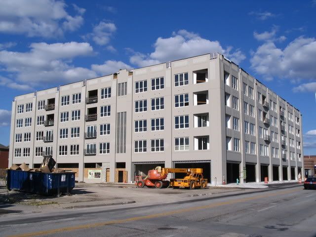
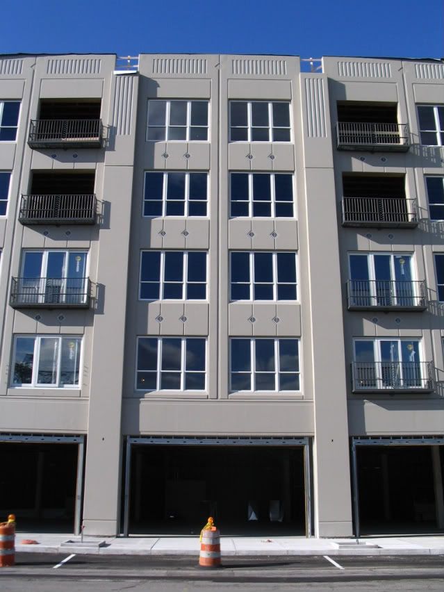
Looking North at the center of the Ohio St. facade.
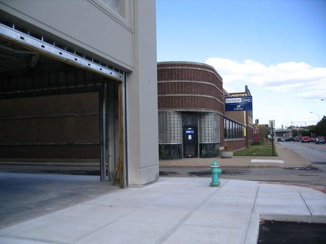
Looking East at the buildings next to The Maxwell.
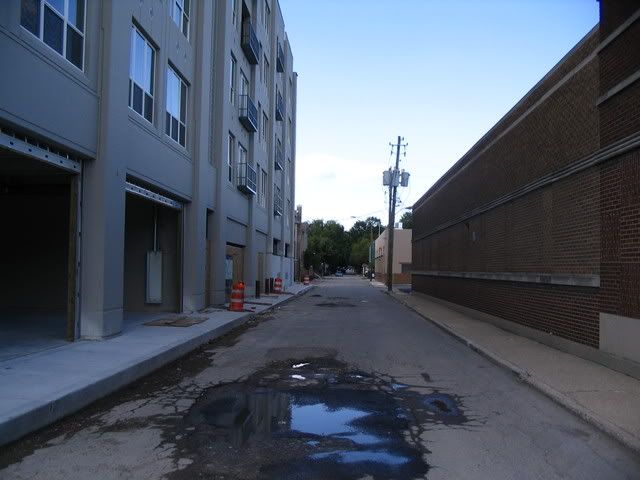
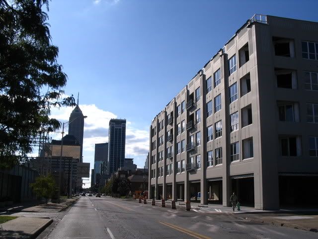
Looking North on Park Ave.
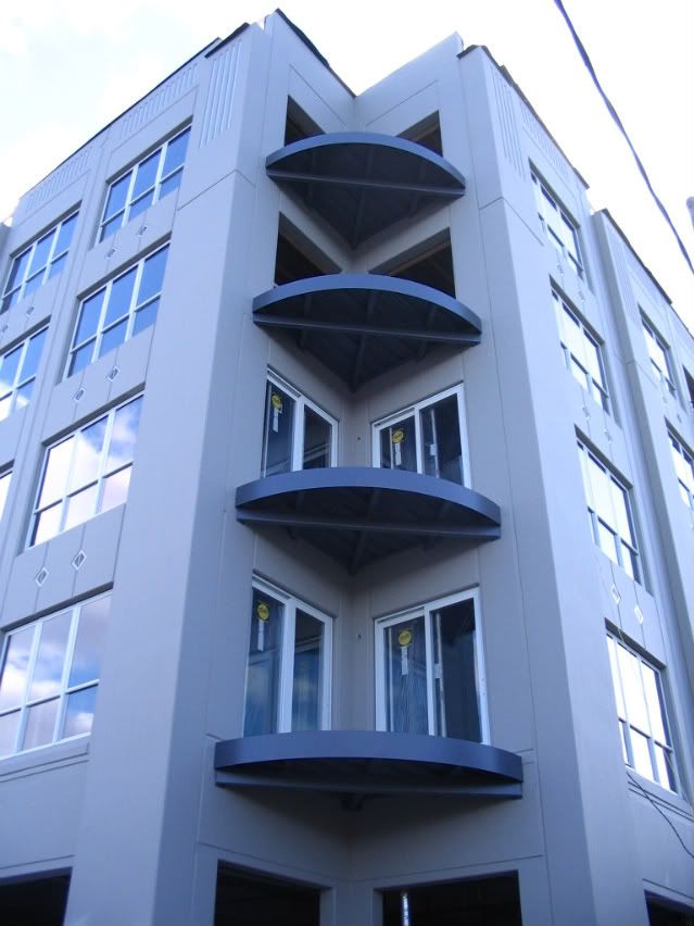
The Northeast corner of The Maxwell.
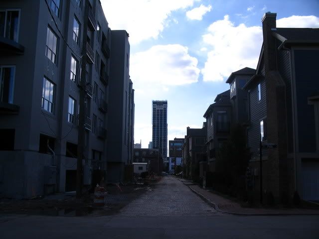
Looking West on Miami St. (sorry about the darkness of this shot)
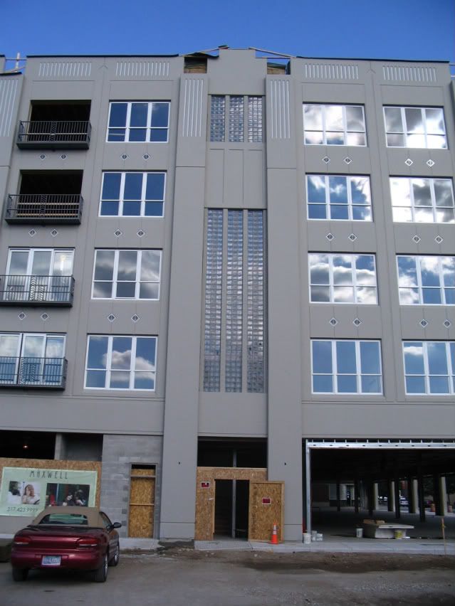
The stairwell treatment on the West facade of The
Maxwell (this also appears on the North and East sides).
Maxwell (this also appears on the North and East sides).



8 comments:
That first picture makes it look pretty stately. While I hate that it's located across the street from that IPL station, I would LOVE to get into this building. It's on the cusp right now, but I think this area will be really great in the next 5 years or so.. especially after the market street ramp is taken down and if the MSA gets developed.
The first picture turned out so well, it almost looks fake. If only it were the completed project, I could try to sell it to K&K for marketing purposes!
I was amazed walking around that area, how cool it is. There are so many old 2 & 3 story brick buildings all built to the sidewalk (which is surprisingly deep in some places). Even the newer 5/3rd branch -- despite the drive-through and small setback from the corner -- adds a little something to the area.
In particular, Miami is awesome and still bricked, with brick sidewalks. You can see it in that really dark photo I put up. I hope K&K builds a matching brick sidewalk on their side of the alley.
I also have to give K&K props for including public parking inside the building AND building some curb-side parking on Ohio. The businesses to the East of The Maxwell could do the same thing at the curb.
I fully agree about the street parking on Ohio: it's great.
It would be nice if they had included some place for trees there also.
Oops. Just noticed the poured-concrete curbs above sidewalk level in the "front and center" shot. They might be spots for trees, although since there is electrical conduit there, they might also be the base of a sign.
overall a pretty good project...good density, built up to the street, at least different from other projects in the area. My only complaint is also about the trees. It seems lots of new projects neglect putting in street trees...this should be a mandate by the city of Indianapolis.
This and the Cosmo are tied for first place if I get to come home to Indy. Great project overall(architecture isn't inspiring, but it isn't gaudy and fake).
Yeah, I agree about street trees. Bloomington requires a certain amount of street trees for every project. Indy should do the same.
I've got another photo here that shows 5 or 6 of those concrete squares in the sidewalk. As thundermutt said, if there was just one it might be for a sign. But with 5 or 6, it's pretty likely that those are for trees.
Post a Comment